'Flow' Is On
 |
| "Lime" ATC for Arts In The Cards swap |
I think I'm in the flow and it is a wonderful, energizing, place to be. I haven't been there for awhile but I sure am enjoying it and hope it will last awhile. Some of you may know that I am a member of a gifted group of artistic women who swap ATCs based on a theme each month. Arts In The Cards has been a real inspiration for me for the past couple of years and I continue to learn a lot from these amazing women
I've been on a roll with watercolors lately. The properties of watercolors enchant me and I am having a great time playing with their capabilities (and my own!) - seeing what they can do on a variety of substrates.
 | |
| 9" X 11" "Journal Quilt Sized" - watercolors and inks on tussah silk. |
Our ATC group recently started an adjunct journey called Arts In The Cards Revisioned. This is to encourage us to use the textiles we love - since we are all quilters in the bone I think! We have very few rules other than to use cloth and, at the moment, to use a regular 'journal quilt' sized format. We tossed around the idea of using squares - or using either rectangles or square - but for the moment we'll all work in a standard size. The 'ReVisioned' part comes into play because we are revisiting, rethinking, renewing, re-birthing or otherwise reconnecting with a thought, image, technique or theme that we think deserves more attention.
 |
| Close up |
For me the choice was easy because I want to continue to work within 'boundaries' and work with watercolors and silks. Watercolors have captured my creative imagination more than most any other medium I can think of and silks are magic to me. I've been coloring them as scarves for some time and just want to continue enjoying the softness and sheen that they offer. I'm having a blast learning about watercolors an silks. They are both magical and their capabilities (and mine!) are being stretched.
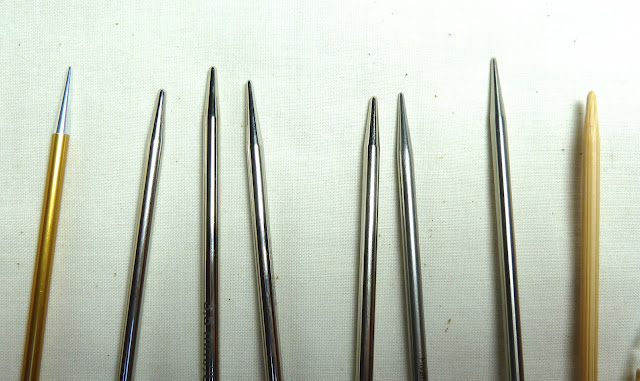
For my first "ReVisioned" project I began with tussah silk for the substrate - stabilized with Sulky Heat-Away. I sectioned the cloth, painted the sections with watercolors and began to draw and doodle - using words for inspiration. It was a process of experimentation to find which pens worked the best. I auditioned Pigma Microns, Koh-I-Noor Rapidograhs, Sharpies, Identi-Pens and more to find which pen bled the least and gave the darkest color. The result surprised me. It was a Bic Z4+ needle point 0.5 nibbed pen. Who would have thought?!
 |
| Close Up |
I used a variety of watercolors (and brands of watercolors) from tubes, pans, sticks and pencils. I used Perfect Pearls and glitter glue. Quilted Creations Crystal Coat Glaze and Sakura 3D Crystal Lacquer played a part as did Ranger's Enamel Accents. I had a ball experimenting with all kinds of things to get this project done.
Transparency in textiles first fired my imagination in Houston at Quilt Festival some years ago when I saw an exhibit of transparent silk textiles from Japan one year at Houston's Quilt Festival. The images have remained in my brain and I think I am finally ready to begin experimenting with my own versions of those lustrous creations. Therefore the backing of this piece is also a piece of tussah silk. The natural light cream color is so beautiful and shiny! Light shines through the layers nicely and it's giving me a point to begin my studies of watercolors and silks. I'm excited with the possibilities and pray that my creative muse will maintain my energy for some time to come.
I think I have actually found a combination of ingredients on which I want to focus some time and energy. Hooray for flow! Speaking of which I highly recommend the book "Flow: The Psychology of Optimal Experience" by Mihaly Csikszentmihalyi. He explained this wonderful feeling so well!
 |
| Another close up |
Have you tried the Derwent Inktense Pencils and Blocks? I understand you can use them on fabric too. Go ahead, get some, try them....hehehe Your Friendly Art Supply Enabler!
ReplyDeleteHere is the link to a Youtube video by Derwent. I think this is sooooo you. http://www.youtube.com/watch?v=eDb5Pqb3uu0&feature=related
ReplyDeleteThose are cool. Glad I stumbled upon this!
ReplyDeleteHow are you getting the font on there? The writing looks like a transfer, print or stamps, but not handwriting! Love these... the blue fields from the aerial photo is MY colors! FUN! And where are you teaching? On island? Hugs, Sarah
ReplyDelete