24 August 2011

Reduction Printing Experiment

Cloth Paper Scissors * Issue 38 *  September-October 2011 * page 40
I decided that I was really going to enjoy this time off - something seems to have shifted in me recently. Maybe having my position eliminated and having to start another job threw a circuit in my head but I am determined to use my time off and to enjoy every minute of it that I can.

This recent article by Lisa Thorpe in Cloth Paper Scissors piqued my interest. I had recently taken my Speedall carving tools out of hibernation so it seemed like a good time to try this technique. Of course I decided to try it on the spur of the moment - after I failed at nap time because I was battling 'monkey mind'. I pulled 4 colors ( yellow, bright lime green, medium green and magenta) of heavy body acrylic out of the drawer,  grabbed a piece of  Dick Blick easy-cut printing block and had at it.  The idea is to plan a a piece, cutting different areas away as you go from lightest color (I used yellow) to darkest color (I used magenta).

When I added the darkest, and the last, color and elements, I also varied the amount magenta I used. Below you can three cards that I printed from lightest to darkest by varying the amount of the darkest color.  I had a lot of fun trying this out and now that I have done one I'll another and plan it a bit better. It does take a "do it first" trial to get an idea of how it all works together. I've never been that great at seeing all of the negative and positive results in my head - so a little trial and error is always appropriate for me.


Top to Bottom: Light, Medium, Dark


Lightest

Medium
Darkest

Upper Right Shows the block print as would now be used.
I think that I would consider cutting four different blocks and using registration marks next time - just to see if I could make the technique 'repeatable'. If I thought of doing this than I'm quite sure that it's been done by many people before. I'll just have to hunt up the results.

23 August 2011

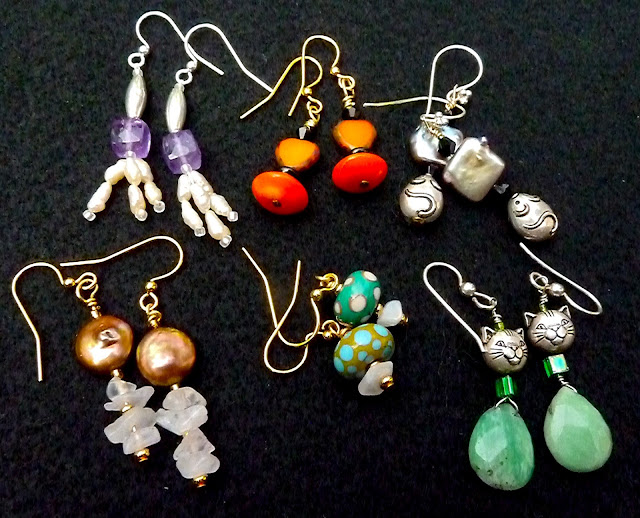
Weekend Earring Experiments

I've been wanting to make some earrings for a long time and I took being on vacation as an opportunity to make some last weekend. I already had everything on hand - most of it bought long ago when the temptation to make earrings first interested me. 

Top left to right: 
amethyst, freshwater seed pearls and silver
Orangeaid: orange glass 'hearts' that I've had for years, orange saucer beads,black Swarovski crystals
Square pearls (silver) 'cheese', black Swarovski crystals and silver mice

Bottom left to right:
round pearls (copper), moonstone chips and gold spacer beads
lamp work beads that friend Janet gave to me years ago, moonstone chips, gold spacer beads
briolettes (not sure what they are), silver cats and assorted seed bead spacers

I had a lot of fun making these earrings and expect I will make more. Since I'm looking towards the future when my Social Security will be poverty level (but hey! I won't have to be at work!) I am thinking up ways that I can supplement my income. I'll want to sell some of the things I make but I don't know what would sell. 

My question to you is: do you think I would be able to sell any of these earrings? Would you pay $25.00 for them? No? How much? I don't buy earrings for myself so I have no idea of what is and isn't a fair price - nor do I have any idea what people may or may not find attractive.  Your comments would really help  guide the direction I take. Thanks in advance !

20 August 2011

Round Robin Book Almost Ready To Set Free.

This top photograph is simple a piece of black fabric that must have seen some sun and gotten 'burned'. The effect of the 'burn' is enchanting though as the selvedge line mirrored the opposite and the effect makes the bluish area look like a beautiful piece of woven silk- which is more obvious if you double click on the photo.

Actually I think double clicking all of the photos will give you a better idea of what this is all about .
I used my chop in wax on the front cover.
In other news. Pen Stuart has started a little a journal round robin. So, by August 29th nine of us will send our books on to another person who will add pages. We we all chose a theme - loosely interpretable- and my choice was typography (letters, calligraphy). Some of the other fun themes are: Along The Line, Beauty of The Earth, Music: Lose Control, Quotes: More Than Words, Night...you get the idea.

I chose to go small with my journal and chose a small size water color journal from Moleskine. I like the size and think it will suit my them.
The right side of the front cover.
The flashy back side (left side) of the front cover. Gold and cloth dots worked well for a bit of bling.
As you open the book this is what you'll see. That's my card on the right in a little pocket

Next page is the sign in page.
My first page - fancy first letter

Next double page a collage of letter forms.  

I may consider adding one more page before I send this little book off into the world. I'll be gone this week so I I may send it sooner rather than later though. I'll be so pleased to see what treasures it will hold when I next have in my hands !

14 August 2011

Tools Of The Trade. What Are Your favorites ?

As most of you may be aware I am an art supply and tool junkie. I wish there was a job would allow me to test drive all sorts of mixed media and art supplies. When I was told that my job had been eliminated my first thought was "how will I get art supplies"? Nothing about food, bills or jaunts - just a fear that I would be unable to enjoy new art tools! 

In honor of my addiction I thought it might be fun to share some of favorite art supplies and tools with you. These are the tools that I reach for almost daily. Although I love quite a few products from the same place all of these tools described in this post were purchased by me - none of them were supplied to me.

I'd love it if you would shares you secret tool fetishes, likes and dislikes with me !

Zinsser 98005 1-Inch Seam Roller $2.99 on Amazon. This handy tool got one star on Amazon but I love it! It works like a dream to roll things flat and assure adherence. I had to buy a second one to have in my "walk-about" journal set. Plus it has a lime green handle - so what's not to give it 5 stars?!!

Sakura 3D Crystal Lacquer. I've never been much of a glossy kind of gal but I had to give gloss a try. In the process I tried a lot of different brands and I have to admit to being partial to the Sakura brand. It really adds a great dimension and can be used as a gloss coat/sealer or, as I generally use it for, a highlight. It holds it shape well - doesn't run as some can and even a heavy coat will dry to a clear lovely gloss over night
Stabilo CarbOthello Pastel pencils. This is a really poor image of a really great product. I generally am not fond of pastels - other than Pan Pastels- but become increasingly curious about them when I saw them used by Lisa Fulmer. I'm glad I plunged ahead and bought them - they're water soluble pastel pencils that are super smooth, don't generate much dust and can really add a great dimension to your work. They work well when used 'over' another image.
Lyra Rembrandt PolyColor oil base pencils - Luscious color that's oh! so smooth!


Pan Pastels. This is one of those products that I hemmed and hawed about getting for quite awhile. I've never been a huge fan of pastels but these changed my mind. They're far more creamy than regular pastels and they blend beautifully. The new pastel tools, sponges, applicators and blenders really make blending easy!

Perfect Paper Adhesive by US ArtQuest. When I first tried this adhesive I thought it was just a tad arrogant to call it 'perfect', but is, exactly that, perfect! I think I have tried almost every brand of adhesive around the art block and nothing has pleased me as much as this . I love that it's matte (they also offer gloss) and, for some reason, it just doesn't seem as fussy and icky to use. Love this stuff!

Ah! Daniel Smith watercolors. Once again I have tried many different brands of watercolors and these just float my boat. They are super pigment laden so you use very little and, while they are most certainly not the cheapest brand, the color goes a very long way.  It's taken me awhile to decide on a favored medium - which is why I encourage experimentation - but I have a definite preference for watercolor now. I am not a water colorist but I can still appreciate the superior qualities of pigment laden, professional quality watercolors.  I also like some of the colors that Holbein and ShinHan have to offer. Holbein makes a line of antique Irodori colors that are beautiful and ShinHans brand of gouache is excellent
Water brush. Made by a variety of companies. This has become one of my all time favorite tools. My friend, Sarah, sent me my first two water brushes and I have to admit that I had not a clue what it was or how to use it . Once my brain connected the dots there was no going back. I love these brushes! The nylon - or whatever it is- fibers allow you to work with one color, then wipe the brush tip off and go right to another color. They are available in a variety of nib sizes from small to wash and also a variety of pen sizes. Small, compact ones to travel with (and have a cover) and 'regular' sizes that are consistently scattered around on my table. Thanks for the head's up on this on Sarah!

Derwent InkTense watercolor pencils have been a favorite for quite few years now. They have rich, luscious that can be applied as a light wash (adding color from a pencil to a water brush) or deep, dense color (adding the color to the paper and then blending with a watercolor brush). 


Another gem from US Artquest. This is their Excel board which comes in a variety of finishes( metallic) and colors. My favorite is 'manuscript' which features an embossed manuscript writing on the surface. I love to lay tissue paper prints on this surface because the embossing adds another layer of texture to the work. I cut the sizes for what I want - I love using it for ATC's
Many of you know that I am addicted to ATC's. Thus, I have tried many, many, different ATC materials from cutting Bristol paper to size to ordering at least a dozen other brands to try. This ATC canvas, another gem from US Artquest, is, in my opinion, far and away the best of the best ATC material.  Substantial, smooth and delightful. I cant use anything else any more. A bit more expensive to be sure - but it's darn near perfect. Comes in black as well as white. I wish they would offer larger packages of it with a price break. I like to use high quality materials for my ATC's because I do try to make them miniature art works.
Color Dusters by Judikins are another tool that I use on an almost daily basis. They are the perfect blending tool. It took a bit of time to figure out the tool I need to do what I wanted to do - which was blend on edges - but I'm sure glad I found these. Available in three sizes. I need some more of them as a matter of fact !
Gesso! Ah! What a wonderful medium it is! Until I discovered Venetian Plaster (below) I always reached for white gesso. There are many brands of gesso and it seems to me that many come close in quality. I've  used Golden brand for a long time but have recently switched to Daniel Smith's brand which I buy by the pint. Many people seem to be unaware that gesso comes in quite a few colors. I only seem to use white - but it's nice to know that other color options are available. I use this not only to seal but also to add texture and to build up specific areas. Another "love it!" item.

The newest addition to my favorites list is Venetian Plaster. When I first went to look for it I thought it was an entity onto itself. What I was looking for, in fact, was, the tinting base. Although this is a more affordable, polymer alternative to real Venetian Plaster it stills provides the sheen and polishing capabilities that the "real stuff" affords. It's cool to the touch like real marble - which really surprised me the first time I felt it. It has a much finer appearance than gesso and polishes to a light sheen. Yep, I love this stuff and reach for as much as I still reach for gesso. I use it it nearly interchangeably with gesso - but I love the fineness and polish I can get with this plaster. It's available in your local hardware store - just remember you want the tint base. The kind I have is from Modern Masters but there are other brands - one day I want to splurge and try the 'real' Venetian plaster made from marble dust.

09 August 2011

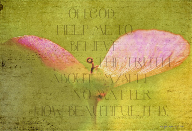
The Truth ABout Myself

My friend Maria sent me this beautiful quote from Macrina Wiederkehr.

Oh God
Help me to believe 
The truth about myself
No matter how 
beautiful it is.

 For some reason this quote spoke loudly and clearly to me and I thought perhaps it might speak to you as well. How many times have people complimented us (me,you) and, rather than accepting the sincere praise, have we side stepped the compliment thinking that the person was "just being nice"? I've done this all my life and it hasn't helped my self esteem issues one little bit. This is a thought pattern that I simply have to break... at least try to break!

Happy mid week to all !

08 August 2011

Opposites - ATC's for August

Starting my cards for Arts In The Cards this month was a truly grounding exercise for me. The burble at work threw me off center for a bit and it was art that got me back on track - but not without a few false starts! The theme this month was 'opposites' and my cards explore the opposites of smooth and not smooth, light and dark, glossy and matte. I used one of my hand carved stamps on cotton with ink, the word 'explore' (because that's what I like to do), and a bit 'o gloss.
I was, finally happy with my cards. I say finally because I had made half of another set that I couldn't connect to and wasn't happy with. Despite the time wasted I decided to toss them and start all over again. The first set (see the photo below) was simply too fussy and packed for my liking. They made me uncomfortable to look at. I'm glad I tossed them - but thought you'd like see how I got from there to here - is it here to there?
These were added to the proverbial 'round' file

07 August 2011

Cherub's Blessing


Thanks to Karen Musgrave I discovered a beautiful poem that inspired this photograph.

The poem was written by  Stephanie Kaza and it goes like this :

We live by the sun, We feel by the moon, We move by the stars,
We live in all things, All things live in us,
We eat from the earth, We drink from the rain, We breathe of the air,
We live in all things, All things live in us,
We call to each other, We listen to each other, 
Our hearts deepen with love and compassion,
We live in all things, All things live in us,
We depend on the trees and animals, 
We depend on the earth, 
Our minds open with wisdom and insight,
We live in all things, All things live in us,
We dedicated our practice to others, 
We include all forms of life, 
We celebrate the joy of living-dying,
We live in all things, All things live in us,
We are full of life, We are full of death, 
We are grateful for all beings and companions.

03 August 2011

Tulip Dreams

I originally took this photo on April 10, 2010. I knew that I wanted to do something with it but wasn't sure what. At that point I knew less about Photoshop than I do now.

I decided to cheer myself up yesterday evening by playing with some of the wonders of PS CS5 and this was the result. I am so pleased with this Tulip Dream. It was worth waiting to be able to do. It has 6 layers and each one really helped make it one good tulip portrait ! Maybe it will be made into greeting cards ?

02 August 2011

When Control Of Your Life Is Not Your Own and A Note On Mercury Retrograde

I was thinking about how difficult it can be to know what to do when the map of your life heads into the unknown and others have control of your direction. Late last week I had decided that this was a time in my life when I, indeed, had no control over my immediate future. I decided that the only thing I could do was to try and remain as centered as I could (and that was tenuous at best for a few days!) and carry on with  'real' life - that being my life away from work.  At home nothing had changed. It was still the place that I can relax, find center and continue on. I love the stability of my life - which is really quite funny because when I young and foolish I used to think stability was highly over rated - if not down right boring. Now I love my routines and my comforting stability. Amazing how your core beliefs can change as you grown up !
You would never know that I love photography by these photos. It was drizzling outside and I just couldn't get the lighting consistent.  This journal page contains some vintage silks, some cottons and inks. I used my favorite new 'tool' - plain white tissue paper - to make the 'veil'.

For those of you who believe a bit in planetary influences a reminder. 
Mercury is retrograde:
Retrograde Begins:        Aug  2  2011    01°Vi12′ R
Mercury Goes Direct:   Aug 26 2011    18°Le42′ D

Why do I care about this? Because I have found it to be an influence that does affect me and I do pay attention to it. There are many explanations about this thrice yearly (though last year we had 4 passes) phenomenon. In searching for a decent explanation I found the following description courtesy of


".....Retrograde Mercury is the most commonly known astrological signature for Murphy's Law ("If something can go wrong, it will"), and is one of the first features intermediate astrology students learn about. Say it to a seasoned astrologer and you'll likely get an amused smile and some delightful stories about how things can get quite unexpectedly unhinged.

Computers crash, software develops unexpected glitches, traffic jams ensue, telephone service snarls up, letters get lost on the mail, machinery breaks down, new projects fail. Ah, yes, the trickster Mercury is up to his old pranks again. In fact, at least three times a year for about three weeks each time Mercury has his way with us......."

01 August 2011

Michelle Ward Crusade # 53 : Mad Scientist


Every month I look forward to Michelle Ward's "Crusades" I get so much out of them and eagerly anticipate the monthly challenge. No one presents a challenge better than Michelle!

I had a lot more ideas in mind to play with along the lines of this theme - until last week when I was informed that my job was eliminated. I have been struggling to maintain focus since then although I know in my heart and in my faith that ll of it will work out. I just got thrown off center a bit. Rather than miss the deadline of today - I decided to use this early variation on the theme.  Thanks Michelle for helping me focus even when the earth is moving under your feet!
http://michelleward.typepad.com/.a/6a00d8341c6e6653ef01538f9f3f3b970b-pi