27 February 2011

A Week Full of 'Goodness'

Here on our small Island we have been relatively lucky this Winter in terms of snow and treacherous road conditions - compared to the rest of the country I think we've had a cake walk. That came to a screeching halt last Wednesday though. The photo above is of my drive to work on Wednesday morning. Much of the time I wish I had a small car. I long for a Prius. or a lime green VW Bug. This week, however, I was very glad to be driving my trusty 1995 Ford Explorer with 4WD. I would not have driven without it. Many folks did not get out of their driveways and the roads were sparsely driven - although schools didn't close until Thursday - or maybe it Friday...
I got new bird food and added some suet to the feeder at work. This little guy spent a lot of time hiding in the food dish protected form the wind and snow!
 The crows were wishing they could join in at the feeder I think!
The sun came out towards the end of the day n Wednesday for just a bit - as the wind kicked up and the temperatures fell. Overnight we had more snow and the slush that had formed during the day turned into black ice. The temperatures were in the teens for the next few days. 
I wore a sweater at work for the first time all winter!
Fast forward to Saturday - that's always what I want to do anyway! My friend Janet had called me last week to tell me that she thought I should come to a class with her - "almost invisible applique". Janet is generally right and she knows me well - sometimes better than I know myself I think - so I hastened to send in my money.

Some of you may know that I am a snob when it comes to applique. I have always love needle turn applique - as slow as it to do - it looks so good when it is done well. I have seen, and tried, many machine applique methods that purport to be nearly invisible do I was quite skeptical about this class from the get go. Taught by Carolyn Hewitt (formerly Hedeen) who teaches at "Gathering Fabric" in Woodinville, Washington - this class may just have changed my mind and made a believer out me. Unfortunately, she does not have an on-line presence or I would have been delighted to have been able to provide you with her information. She is available through Gathering Fabric.


Carolyn's color are soft - she adores pink and her quilts are what  I might call 'folk-ey'. Absolutely beautifully composed and  perfectly done- with applique that truly is almost invisible. Here are two of her quilts. Her attention to detail is so darn good!
 Below you can see how nearly invisible the stitches really are.
 Below -the stitches on the back of the fabric
Carolyn uses freezer paper (her preferred brand is Jenkins - and, after trying both I can see why. It's a bit thicker and gives you a nice edge to "give the fabric some memory before pressing". She uses a Hobbico sealing iron. I like these too - they have a nice point to get into small spaces. Liquid starch is on the materials list - I had some Sta-Flo already mixed but Carolyn uses another brand. I think - but am not 100 percent positive - that it is Mary Ellen's Starch.  She uses invisible thread in the top - I think her brand was SewArt (I like SewArt or Superior monofilaments the best) with a 50 wt thread in the bobbin. I tried it with a regular prewound cotton bobbin and had good results - and I also think that the Bottom Line (also available through Superior) would would exceptionally well - it's my next experiment). She suggested a size 70 or needle. I think what sets this technique a bit apart is that she uses a VERY shallow zig zag stitch. Shallow enough that it would work on the straight stitch plate of many sewing machines. On my Bernina 153 I used a 1.5 - or slightly less- on the width and 1 to 1.5 on the length. The thread just picks up at the edge and leaves a small hole where the stitch is. I also found that by simply running your thumb over the stitches you can make them ever more nearly invisible. I am [pretty excited about this technique and am so glad that Janet tugged me a little to get me to go with her !
We had a good turn out of 18 for the class. We are always delighted to be able to use our Senior Center as a classroom. Great lighting, kitchen and light. What more could anyone wish for?! Carolyn said that she generally teaches classes of only 6 at time, but this number seemed to work out well and we were all grateful that she made the trip to our island (by ferry) even in such nasty weather!

Gee - I wonder whose machine this could be?! My beloved 180  stayed home.
I  have been considering another sewing machine - 
but I don't think I would ever want to give up my Orange Delight as a trade in!
I had a group of ATC's that were sue to be mailed this weekend. These are made for Roses On My Table ATC swap group. The theme for February was "Love". I have a thing for angels - they represent love to me and so these cards used them as them. I painted Lutradur with acrylic paints and inks; stamped using stamps by Sherril Kahn and Making Memories and then textured and stamped a brass heart for the focal element. Phew! I made the deadline with not a moment to spare!

I have jury duty that starts tomorrow. I am so sad to lose my days off! If, by some odd quirk of fate, I am selected, then I could lose two weeks of income too. Hopefully, I will be attractive for whatever the trial is about. Can I knit during these things do 'ya think?!! Draw? Write? Use my IPad? IPhone? Just what can one do whilst one is, none too patiently, waiting?


22 February 2011

Weekend ATC Marathon

As always seems to happen to me in February I was just a tad behind. As a friend mentioned - February is only two days shorter than a regular month - but it always seems to catch me by surprise anyway! I had two groups that I needed to get ATC's made for this weekend. I just finished the largest batch - made for Arts In The Cards.

The theme was "reuse and recycle". Last Friday I grabbed some paper from the wastebasket and set it in a bowl of hot water and soap to macerate for a day or two and then I made some rough molds of faces. It was not a totally successful experiment but several of the faces were fun - and they appear on some of the cards. The other faces are made form polymer clay - they had been rejects from an earlier project. The cards themselves were all made from papers that I had created and previously rejected. With a little reworking and embellishment they became useful again!
My personal theme for this batch of cards is "Listen" and "Hear" - sparked by a quote from Epictetus that says" we were given one mouth and two ears so that we can listen twice as much as we speak". I like that quote!
Off to make the next round - only 6 this time - for my friends at Roses. Plus I am taking a one day class this coming weekend on an "invisible" applique technique - I need to get that all together too. Work tomorrow morning. I need a nap !

19 February 2011

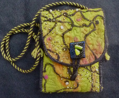
Stylish 'Coats' for Ipod and My New IPhone

Being as Apple Computer addicted as I am I'd waited, with bated breath, for Verizon to release it's IPhone. In fact I hadn't renewed my contract for over a year hoping that the IPhone would, finally come to Verizon. It has arrived! I'm not on the phone a lot and I really had to consider whether or not "I deserved to get an IPhone. Thankfully, I had a contract renewal discount so, ultimately, of course(!),  I was one of the first to order one. My next consideration was to get a cover to protect it. I  spent a good deal of time searching and looking at cover options. Many of the best protective covers were bulky -although I can see where they would, indeed, provide good shock protection. The better cases were quite expensive (designer and full grain leather) with the alternative being a simple protective skin that protects the finish and screen - offering no shock protection at.
My answer to my problem was to get a polycarbonate rear cover that is a the best "poison" green I could find - and to make a protective felt bag myself. I'm not sure that what I have done will provide great shock protection while I am holding the phone - but it will, I hope, give it some insulation if it inadvertently dropped while it's in the bag.
I used a nice thick base of wool roving that was first needle-felted and then wet felted. Next I used an 80/20 fusible batting and a layer of a perfectly matched vintage kimono silk from my favorite silk person (Ah!Kimono).  After layering it all together I machine quilted it. I hadn't planned to bead this bag but it seemed to 'want' me to and so I did. I didn't want all over beading but rather a 'wash' of beads from corner to corner. Next decision was the handle - and that had to be done with a Kumihimo disc of course. It came out great - although I should, by rights, do it over. I seriously miscalculated the amount I would need and had to add new lengths as it was on the bobbins so I have one area that, although strong enough, needs a bit of cosmetic help. It could have been worse though - and so I am happily using the bag until I have time to redo the handle. It's long enough that I can put it over my head or under my arm. This length, I have decided, is the most versatile - allowing the bag to be carried in a variety of ways as well as being put in a purse.
The wool roving is from Outback Fibers - which offers my favorite variegated roving colors as well as the best assortment of pre-felts! I made the fused glass button during an outing with the Divas from Fidalgo Island Quilters. I think I am going to simply HAVE to get my kiln fired up this year again and make some more of these buttons!
The lovely "poison green" polycarbonate rear cover is made by "Splash". They come in a great array of colors and fit the phone very well. Green seems to be a particularly difficult color. Most of the available greens seem to be either very 'blah' or very 'neon'. Too blue cast green and not enough yellow cast green for my taste. I was very pleased to have found this one.
My Ipod needed a new bag. well, not really needed since the old one is still a near perfect fit for it but I wanted a bag that had a cut out space for the click wheel. Once again my aim was shock protection. I had once dropped an IPod - a short distance but a drop none-the-less. I listen to my Ipod a lot at work when I am doing something mindless like filing and I wanted something that would allow me to 'wear' the bag and have the ability to turn the music on or off easily without having to take the Ipod out of the bag.
This was the result of my first click wheel cut out experiment. I say the first experiment because I am not 100% satisfied so I know there will be more in my future. It might be the party colors. This was a piece of felt I had started some time ago with the intention of giving it to someone. It's out of my usual color box. Maybe that's a good thing. The cut out idea works perfectly though and the long Kumihimo handle allows me to carry it over my head or under my arm with no problem. I was able to turn the music off easily if someone asked a question - or I had to quickly answer the phone.
I'd made the goofy face I used as a faux button long ago and it seemed to match these party colors quite well. I anchored it with thread but then glued it to the felt - wondering if gluing it would even work - it did! Very well! It's a faux button because I used Velcro on this bag (for the first time). Surprisingly, thus far, it has worked very well - although I am not thrilled with the look. If I had black maybe it would have been less glaring that the White I had on hand. I may have to try dying Velcro to match if I use this method in the future for new bags. I want to use the bag for awhile to see if Velcro really is a good alternative to a real button.
The Kumihimo cord came out really well and it matches nicely. Although, as I mentioned, these party colors are out of color box they perfectly match my IPod skin - which I designed from my own artwork through Gelaskin. This bag was also needle felted, then wet felted and then layered with fusible batting and silk before being free motion quited - and , of course, I had to add just a few beads to the mix!
It's been awhile since I made felted bags and it felt really good to get back to it. I have some others in mind - but need to get a few 'ingredients' first !

More fun coming this weekend... and I feel a more 'pithy' post noodling about in my head! Hope many of you enjoyed the SUN today! We haven't had such a sunny day in a long time - it was cold - but well worth the rays it brought. We've had weeks of dank, dreary, dark weather so this was an especially appreciate break!  Thanks for reading !

14 February 2011

Saint Valentine's Day

My passion for history generally compels me to look into the history of people, places and events. History.com is a great resource for information and today History.com was kind enough to answer my question about St. Valentine's Day even before I thought about it. The history of this special day was waiting for me in my email "postbox" this morning. I thought I would share the information with you!

the date: February 14: the year 278 : the event: St. Valentine beheaded

On February 14 around the year 278 A.D., Valentine, a holy priest in Rome in the days of Emperor Claudius II, was executed. Under the rule of Claudius the Cruel, Rome was involved in many unpopular and bloody campaigns. The emperor had to maintain a strong army, but was having a difficult time getting soldiers to join his military leagues. Claudius believed that Roman men were unwilling to join the army because of their strong attachment to their wives and families.

To get rid of the problem, Claudius banned all marriages and engagements in Rome. Valentine, realizing the injustice of the decree, defied Claudius and continued to perform marriages for young lovers in secret. When Valentine's actions were discovered, Claudius ordered that he be put to death. Valentine was arrested and dragged before the Prefect of Rome, who condemned him to be beaten to death with clubs and to have his head cut off. The sentence was carried out on February 14, on or about the year 270.

Legend also has it that while in jail, St. Valentine left a farewell note for the jailer's daughter, who had become his friend, and signed it "From Your Valentine." For his great service, Valentine was named a saint after his death.

In truth, the exact origins and identity of St. Valentine are unclear. According to the Catholic Encyclopedia, "At least three different Saint Valentines, all of them martyrs, are mentioned in the early martyrologies under the date of 14 February." One was a priest in Rome, the second one was a bishop of Interamna (now Terni, Italy) and the third St. Valentine was a martyr in the Roman province of Africa.

Legends vary on how the martyr's name became connected with romance. The date of his death may have become mingled with the Feast of Lupercalia, a pagan festival of love. On these occasions, the names of young women were placed in a box, from which they were drawn by the men as chance directed. In 496 AD, Pope Gelasius decided to put an end to the Feast of Lupercalia, and he declared that February 14 be celebrated as St Valentine's Day.

Gradually, February 14 became a date for exchanging love messages, poems and simple gifts such as flowers.

08 February 2011

Experiments With Watercolors

This is not a piece I am very proud of but I did learn a lot from it. I've not ever really used watercolors, except for a dribble here or a dab there, but they have been calling to me a lot recently. I decided it was time to spend some time investigating the potential. I expect to experiment with them for some now as they have managed to enchant me.

What did I learn from this experiment?
  • don't OVER WORK a piece - leave when you first think it's done
  • apply washes in LIGHT layers
  • THINK AHEAD - plan for anything you want to add later on. If you wait you'll get a piece that is over worked and will take more time to try to save! Saves on frustration.
  • ENJOY the feel of the paint on the paper. There's nothing quite like it.
I did the lettering first in several complimentary colors using fine tipped pens. It made the piece WAY too busy and distracting. I almost threw it away at that point but I went to bed instead. This morning I decided to darken the letters and make all of the writing one colors - using a thicker black nib. It helped but I still wanted something else. I added a partial overlay of a rayon silk, transparent-when-wet, paper. That managed to tone down some of the frenetic quality and it softened the image a bit - which is what I wanted.  It's still a NOT favored piece but I am glad for the lessons and have another piece in mind which I will hopefully be more pleased with. 

The problems with this piece began way before the letters were added. It was lovely and soft but I used darker colors to define some lines and areas and that's where it started to go wrong. Had I added the words before I added darker colors - and used the lettering as the definition it would have produced a much more pleasing image. That's why I mentioned to stop when you are first happy with the look!
Despite the decidedly busy nature of the colors it brought to mind a poem about silence by Sri Chimoy from " Songs of the Soul". I paraphrased the portions I used but the entire poem is copied below.


 ***********************************

"......My silence bridges the gulf between my life's success and my life's failure. My silence does not magnify my defects. Nor does it connive at them. My silence transforms my defects into strength indomitable.

My silence is a climbing flame that warms my world of despair. My silence is my inner light. No problem of mine can defy solution. My silence is a selfless distributor of joy to ever-widening horizons.

In my silence I become a man of sterling character, a prolific writer, a voracious reader, a divine lover, a profound inspirer and a triumphant liberator.

In my deep silence I never become a victim to ignorance, the greatest calamity that can befall any human being. In my growing silence I am convinced that even as a man on this earth I shall be able to reach heights, transcendental, divine.

My glowing silence alone can accelerate my Godward march.

My spreading silence makes me see, feel and possess satisfaction, unalloyed satisfaction. 
No more have I to let loose a tirade of tenebrous dissatisfaction.

In activity and vitality I proudly and wrongly feel that I shall have to take care of the whole world. In the heart of silence I humbly and unmistakably realise that it is the Divinity within the world that took care, takes care and shall for ever take care of the entire world.

Silence is my unceasing petition. Silence is my unreserved preparation. Silence is my unlimited realisation. Silence is the unfathomable fount of my life here on earth, there in Heaven.

What God's Silence is . . . is the Eternal Truth. What God's Silence serves is the Eternal Purpose. What God's Silence becomes is the inevitable Fulfilment......"

(Songs of the Soul by Sri Chinmoy )


07 February 2011

My Day In Frame

A couple of friends wrote about my post yesterday. They said that it would be helpful to see the shawl wrapped. Now, mind you, there's a reason that there are not many photographs of me out there and a reason why I am, generally speaking, the photographer and not the "photographee". I dislike the way I look ! Stacey suggested I take my own picture in the mirror. Well okay - here 'tis! The shawl does reach past way past my waist even when worn this way. I like this shawl!
When I put my camera down yesterday I looked at the screen and it had, magically, positioned itself on a word I had just written. The whole effect really fit the way I was feeling - serendipity!
Tizzy Tillie was being especially sweet - exploring the shawl as it was drying. Then she snuggled up on a quilt and under a pillow that was on my chair. I couldn't resist snapping a few photos of her! Last night I had nightmare about a shooting in a night club - seemed like it was during the 1930's or something. Just as a person I knew was about to be shot Tillie woke me up with a gentle paw on my face. I knew I was really moved by the dream because found out I had woke DH up - and because my pillow was damp with tears. Tillie must be a little guardian - she seems to know what's going on in my head!
 Taking a break from chasing bottle caps around and spreading catnip all over the floor!
 What a face! I am SO glad she chose to come home with us!
One of my ATC swap groups, Arts In The Cards, had a little envelope swap recently. We stuffed a 5" X 7" envelope with small bits of treasures and cloth. The photo above is what Karen sent. Too much fun!
The photo below is what Janice sent. My envelopes are ready to go in the mail. I love this group! WE have so much fun and the art that arrives in my mailbox is awesome!

06 February 2011

Berroco Blackstone Tweed Camus Shawl Finally Finished!

Yeah! Finally finished! I began working on this shawl last October and took the blocking ins out yesterday! I've become fixated on shawls. I love them and wearing them in our capricious climate makes them a perfect accessory.  This pattern is from Berroco and is called the Camus Shawl. It's a large, cuddly sized shawl, that I made even larger. I love the faux woven effect that the pattern makes.  

The yarn is from Berroco's Blackstone Tweed™line. It's a worsted weight yarn with 50 grams yielding 130 yards. Gauge = 18 stitches to 4 inches on a US size 7 needle. Fiber content = 65% wool , 25% mohair, 10% angora rabbit. It's lovely soft yarn that softened even more after being washed and blocked. The only caution I would offer is that when I was adding the "woven" effect - basically running  four pieces of 100 inch strands of yarn through the length of the shawl- the yarn frayed and split quite badly. One entire ball of yarn was almost a total waste. I had to splice a lot. In the future I might consider using a more firmly plied yarn for the 'weave' - although I love the tweedy look of this yarn a lot - so I might choose it again being forewarned of it's propensity to fray. I would suggest buying at least one extra ball of the 'weave' yarn color to allow for any splitting and splicing you might have to do.
 My finished shawl is 72" X 80"   (68.58cm X 203.200cm). 
I made is somewhat larger than the pattern - deciding to just use all of the yarn I had.

Rather than leaving the fringe as is - I braided the first couple of inches. I think it will keep the fringe from tangling as much and I like the finished look better. Difficult to see in the photo below. It really didn't felt as much as it looks like it did.


Now that shawl is finished I am returning to work on my next shawl. An easy lace pattern  called 'The Heartland Shawl' from Cheryl Oberle's great book "Folk Shawls". I'm using Fila Di Crosa Maxime Soft Sock yarn to knit it.

02 February 2011

Kandi Corp's New Encautic Hot Wax Art Supplies

 Kandi Corp's Hot Wax Art Stylus and tips, a printed design on rice gampi paper, Kandi Corp's encaustic wax cakes,
I have always been intrigued by encaustic art but have never tried it before the great people at Kandi Corp surprised me by sending me samples of their newest line of Encaustic Hot Wax Art supplies. I was eager to dig in and see what these encaustic wax tools were all about! 

In case you are not aware of it - Kandi Corp is the company that, I think, most popularized hot fix Swarovski crystals, rhinestones and metal embellishments. They are also the company the makes the DeColourant supplies that I previously reviewed.  Not only are their products kind of cool but the people who work there are genuinely good, helpful folks. If you have a look at their website you will find a variety of projects suited to the use of their array of great products.
The selection of  tips included with the Stylus

The Hot Wax Art Stylus is very versatile tool and comes complete with five unique tips. They allow you to produce a wide variety of lines and marks. You can cover a larger area with the large 'paddle' tools or achieve precise, fine line, details with the pointed tip and wire brush tips. The round tip makes an array of different sized circle depending on how much wax you use and how light your touch on the paper is
Hot Wax Art Encaustic Cakes
When I first saw the size of the cakes I wondered just how fast they would be used up - they seemed small to me - as do the other encaustic wax cakes I've been tempted to buy in art supply catalogs. After just this little bit of playing, however, I can see that they would last quite awhile.
 Color Chart For Hot Wax Art Cakes
Paperwork included with the Hot Wax Art Stylus. Included Stylus tips: Pen, Brush, Paddle, Edging and Ball

Helpful lighted on/off switch on the Stylus
The one 'color' that I would order a double of is 'clear'. The provided colors didn't include a 'clear' and so  I tried to using a sheet of plain beeswax that I had on hand to dilute - or lighten- the colors. I think 'clear' would greatly enhance your palette options - as would, of course, a cake of black. The worked  alright but I'm certain that the ready made wax cakes would make for a much smoother blend.

My 'method' was to simply dip the preheated Stylus (fitted with one of the tips) into the wax cake and then apply directly to my paper. The wax is very easy to remove with a paper towel before you go on to using another color. This small bit of experimentation has made me realize that this is, indeed, a technique that I would like to take further. Working directly from the cakes is quick, effective and as easy as it gets. In the future I may consider buying a used electric griddle which would allow for the waxes to become heated before they are needed...not that heating them takes a lot of time - it would just be one more avenue to consider.
A sheet of beeswax that I had on hand and used to try to dilute the colors in place of a cake of clear wax
The fine stylus tip was probably one of my favorite tips. As you can in the photo below it allows you to load quite a it of wax which facilitates being able to apply very precise, fine line details with ease.
The pen tip affords great control for precision work. It reminds of Tjanting needle tip used to make batiks. 
The photo below shows my very first attempt as applying wax to a a surface. The orange squiggle on the left was made with the smaller of the two 'paddles' tips held in it's side...rather like using a large calligraphy tipped pen. The pinkish shapes on the right were made using the larger 'paddle', the green dots were made using the ball tip and the orange 'brush' strokes around the green green dots were made using the wire tip.
 Below: Fine line details made using the 'tjanting type', open sided, tip.
Below:  I couldn't just let the lines remain simply lines on the page of course! I had to play around with combining the colors and tips. Yes, I did have a fun time exploring some of the myriad possibilities.
 Below: Which way does it go?!

I decided to try using the supplies to create a 'real' painting. Knowing nothing at all about how these supplies should - or could - be used allowed me to truly play- unencumbered by any notions of what I should - or shouldn't - be doing. I printed a circular image onto a piece of silk Gampi tissue and then used the wax cakes in varying combinations of colors and Stylus tips to build a design around the circle. Diluting the colors with the beeswax gave me a nice, warm, golden tone. which I find appealing, but I think that using  'clear' cakes would yield truly desirable color variances and, most likely, would also allow for a much smoother application. That being said what I really enjoyed about using wax  is the textural elements that you can build up layer upon layer with the wax. I am excited about some of the things I have in mind to try. I want to make a layered piece and I want to try embedding small leaves into the layers. There are endless interpretations of encaustic techniques I think.
The 6" X 9" page I made using  Kandi Corps Hot Wax Encaustic Cakes in Carnation Pink, Orange & Spruce Green (plus some plain beeswax) and their excellent Hot Wax Art Stylus Tool
Detail showing how the wax can be used as a texturing medium

Wax textured with paddle, ball and wire brush

Thank you Kandi Corp for allowing me the opportunity to play with your wonderful Hot Wax tools.


For the FTC :I was supplied with these products by the manufacturer for the purpose of honest review. No other remuneration was received!