If At First You Don't Succeed : In Case Of Emergency Redux
 |
| Before |
 |
| After |
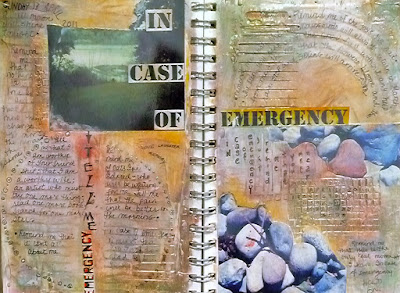
I wasn't happy with the page I made for Michelle Ward's Crusade #50 - posted earlier today. I just couldn't let it rest so I decided to take more drastic action rather than waste the background which I really liked. I cut out the offending areas and replaced them with old family photos that are close to my heart. Although I would perhaps still like more contrast in the piece I am much happier and now feel that I can move on to another page - of something !


marie - i love that you admitted being frustrated with the pages and decided to have a second go at them. bravo for not pulling out and for determining what could be done that would be more pleasing to you. i love that adding the family faces was the magic element.
ReplyDeleteYep, I like the difference, although I liked the first pages too. Just shows how important it is to capture what's in your heart and head when you create. Good on you.
ReplyDeleteWow this is a cool re-do! I love seeing the before and after. Very brave.
ReplyDeleteThis reminds me I have to get cracking on #50 myself!!
Best wishes from germany,
tj
I looked at both of these versions. This is great, to see the process of an artist's piece. I really like what you did, although I liked the first one, too. Your surfacing practice is really showing some great results.
ReplyDeleteThanks for talkinga bout your process! It helps us all to grow.
I like the first one, as well as the second. But I really love the backgrounds - all the blending of color and text. Glad you tried again. I do that, too, and usually like the page because it's got all these "layers".
ReplyDeleteThanks for sharing.
Great to see both side by side - the second layout seems to be "tied" together better (? - a bit hard to describe!)
ReplyDeleteBravo! This is a great spread!
ReplyDeleteI love that you added the photos, it makes that background with the textures more tantalizing.
ReplyDelete