Seasonal Wardrobe & Seasonal Color Choices
Each month Michelle Ward posts a unique challenge on her Green Pepper Press Street Team Blog. This month's "Crusade #52" is about your seasonal color choices. Do you change your palette when the skies are blue and the sun is warm? It posed an interesting concept. I find that I generally use the same basic color palette year round; both for art as well as for clothes. My clothes always include black. It goes with anything and, in art, it gives such a nice punch. Of course, I don't tend to pastels or I might not say that! In fact, working with monotone and pastel palettes is one of personal challenges this year. I plan to have fun challenging myself to step away from my comfort colors.
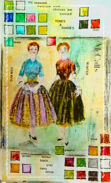
My comfort colors include all green-gold, olive, poison, ick and lime greens - though not too neon bright. I love ochers and deep yellow golds as well as reds and burgundys of a variety of shades. My staples are black, gray, navy and white or off white. I use brighter tones of my favorites in the summer and warmer shades of them in the winter.
For this page I used a transfer from a vintage clothing pattern that I colored with fanciful ideas of what my summer and winter colors might be. The colors in the square-ish shapes are more true to what I really wear. I always have fun with Michelle's 'crusades' and there are some extremely talented people who in my fascination and addition to the monthly treats!
I think if I lived in a place like Dallas again I make more use of colors like white and turquoise. Where I live we have rainy periods even in summer - maybe that's why I tend to just use shades and tones of my favorites? Hummmmmm????
How about you? Do you find yourself using different palettes for your art and clothes in the summer?


It's an interesting idea. I tend to have the same colors year round-mostly blues, teal, coral. This year I haven't even gotten any summer things out-still wearing sweaters!
ReplyDeleteLove your layout! The pattern transfer and colouring as come up so well! I like how you tied the colours with the patterns too.
ReplyDeleteLove the design on this--and the weaving of what you are wearing and what colors you are mixing into your palette is clever. What a cool transfer! Nicely done.
ReplyDeleteThe comment on color and geography is right on. That's what I noticed in my response to the challenge, too.
I love the color squares. I may have to do another one of these!
I like the thought of calling seasonal color choices your "comfort colors."
ReplyDeleteVery nice page, love the transfers.
ReplyDeleteI love that you used a vintage pattern to showcase your color wardrobe! I like your comfort colors too. I'm a wearer of black as well, because it really does go with everything :)
ReplyDeleteWhat a great page! I really love the colour square and the transfer. It's so interesting to see everyone's different palette and to find out what might influence that choice. I think I am just discovering colour after years of a very dark, basic and servicable wardrobe!
ReplyDeleteFunny how many of us admit to 'wearers of black' like it's some sort of character fault LOL! I do it too...
ReplyDeleteLove your colours, and their descriptions - ick green tells me a lot oddly enough. I knew exactly what you meant :-)
This layout is so cool. This is embarrassing to admit but I love all the color boxes, they just scream "Fun"! I would kill to have one of those skirts! Gorgeous layout!
ReplyDeleteThis work is absolutely stunning! I love the squares of colors you've incorporated in your layout! J'adore!
ReplyDelete